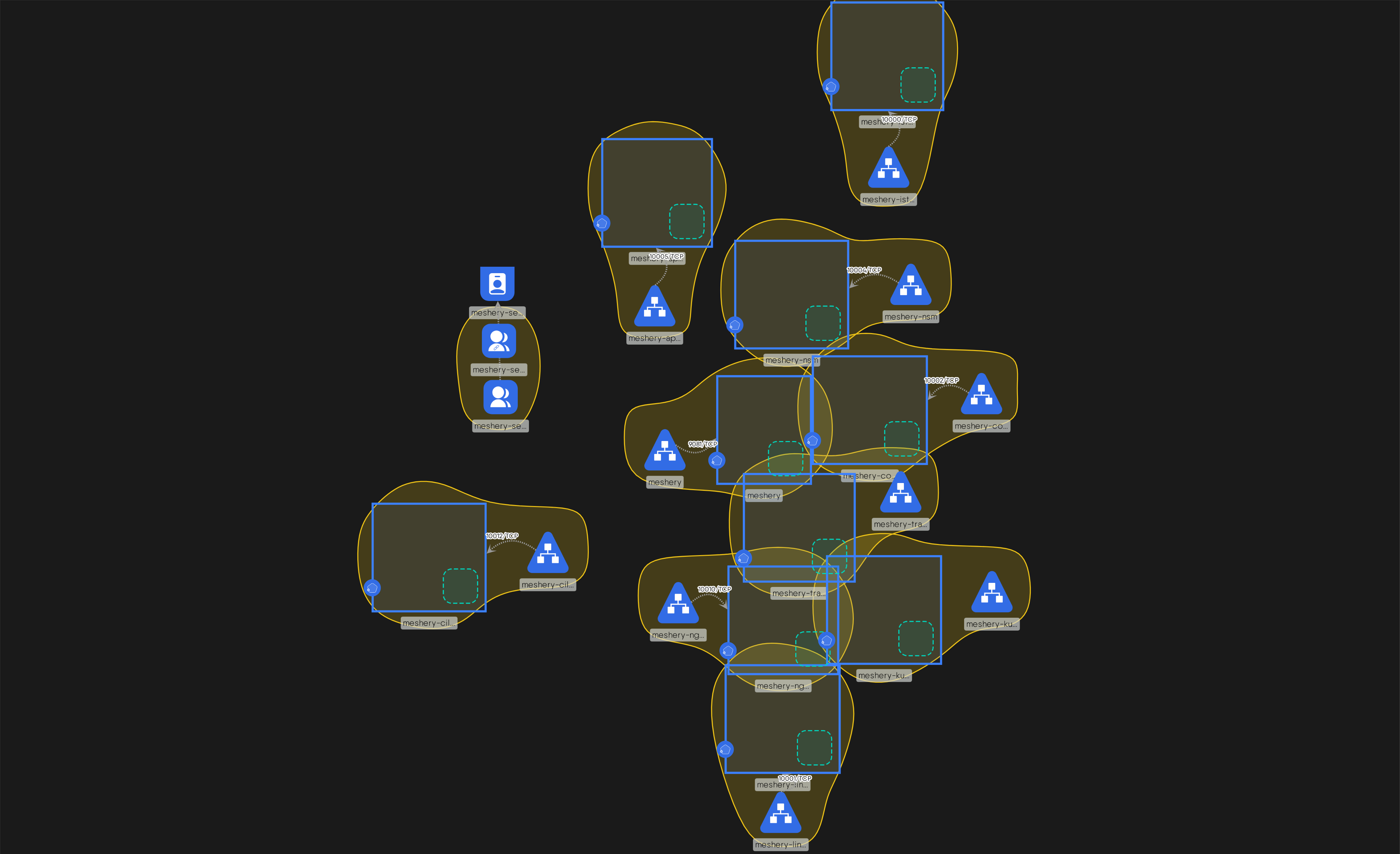
I’ll suggest that this visualization would be easier to comprehend, if the dotted green, rounded rectangle is not displayed at all, but that the only time this rectangle displayed is in the feasibility phase of the relationship evaluation process (in other words, only displayed while a user is actively changing the design and dragging / dropping components and creating relationships) and that this rectangle is not captured as part of a static snapshot (a screenshot of the infrastructure design at-rest).
i think we may hide it when there are no configured inventory items ( i.e it is empty ) but keep it when there are any ( because it wont be waste of space then) . also maybe change the stroke to same color of the parent might make it a bit more subtle .
If we remove it completely it might be a bit difficult visually differentiate b/w inventory and parent-child relation .
I am very new to all this but here’s my thought. Purely from a visual perspective, I would feel overwhelmed. I get to show such representations to relatively non-tech people and they would probably find it a lot. Especially, the overlaps of the yellow boundaries (deployment+service) and the blue boxes (deployments).
As a future roadmap may be:
Have a toggle switch or an option to generate a snapshot that is a HLD and does not include the details such as inventory items (I hope I got the term right, the green rectangle). or may be generate both and attach them?
When there are more than one set of deployment+service (this snapshot as an example), have a way to automatically space them so the overlap is avoided. So, when the snapshot is generated, it is more legible.